Projects
circell
puny
barcelona, posa't cuca
vi de pagès
welo works

Hi!!!
Thanks for actually reading this. It's not a 30-second video, it's text! Who writes more than 120 characters these days?
Who am I? That's a heavy question to start with; sometimes it's easier to say what you do than what you are. I do quite a lot of things... I think, reflect, turn things over, research, try things out, and then: I draw, make ceramic pieces, design interfaces, write, lay out fanzines... The process isn't linear, while I'm making something I keep thinking about the meaning of the content or the form, and that often ends up changing it.
In recent years I've worked in the digital world without losing touch with people. I love interviewing users of the digital products I design; they always tell me things I would never have thought of, and those eureka moments are what make me happiest, because from them I can build something that makes their day-to-day a little easier.
I've always had a soft spot for physical formats, they feel primary, they're standalone objects, not tied to a network that depends on energy and corporate conglomerates to stay up. That's why I keep up a more reflective artistic practice that takes shape in tactile or visual work.
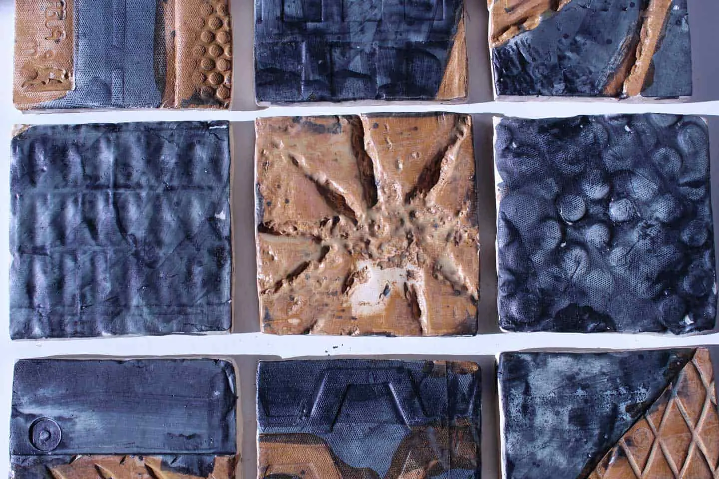
Textures Metropolitanes de Barcelona (TMB)
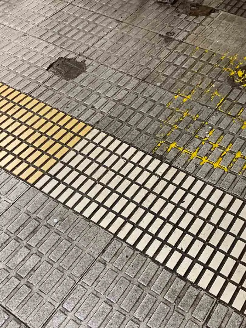
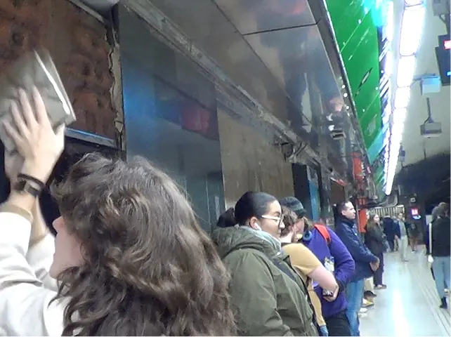
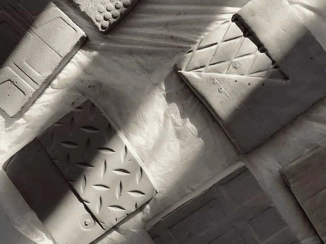
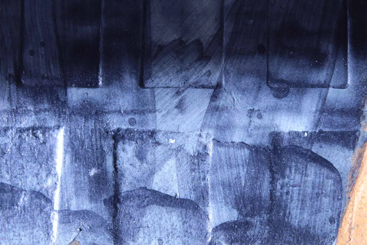
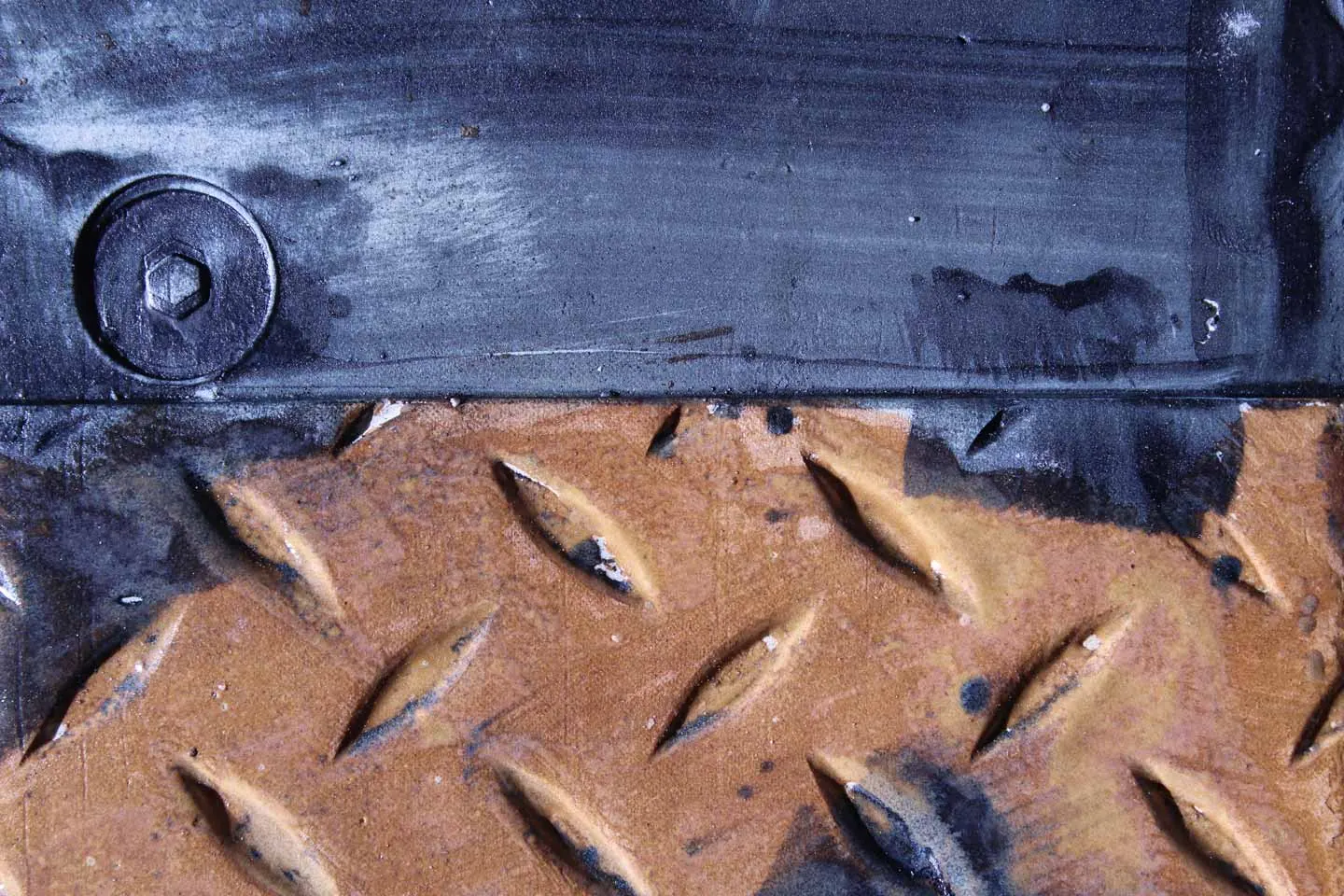
The subject of this project is the textures found in the Barcelona metro. Because of where and when we encounter them (public transport as a place of passage), they are rarely appreciated in their natural habitat.
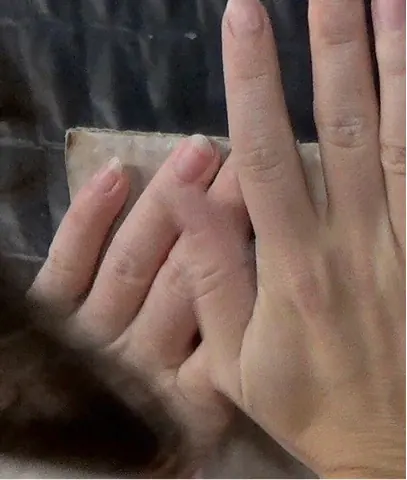
Capturing these reliefs comes from a call to awareness during journeys. Instead of treating them as intervals of time and space to be tuned out, an attempt not to be conscious of the temporality we can't escape on a commute, this work gives value to architectural and industrial features that often bear traces of human impact. Like elements in the street: although part of an underground network, the metro is an extension of Barcelona's exterior; it isn't really an interior, but rather another street, another zone of passage in the city.
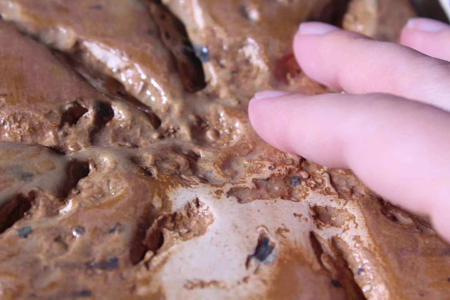
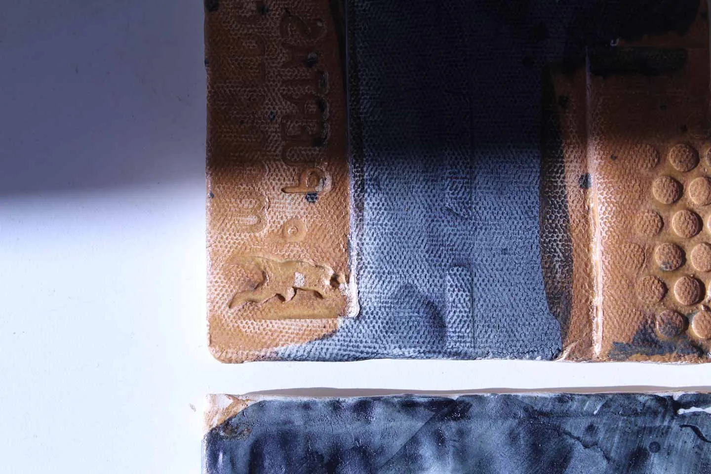
The surfaces that hold these textures are usually dirty and out of reach. Even when they aren't, the memory of health measures keeps us from enjoying these reliefs. At the same time, the project breaks with art as untouchable object and treats it as a public tool for understanding the world. For these reasons, a series of panots (paving tiles) reinforces the unconscious, passing character of the metro, tiles you can look at up close, explore, and above all touch.
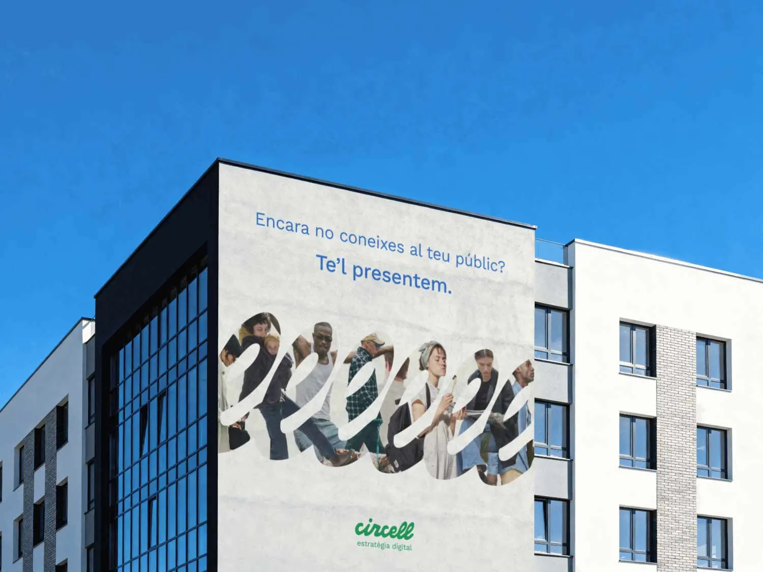
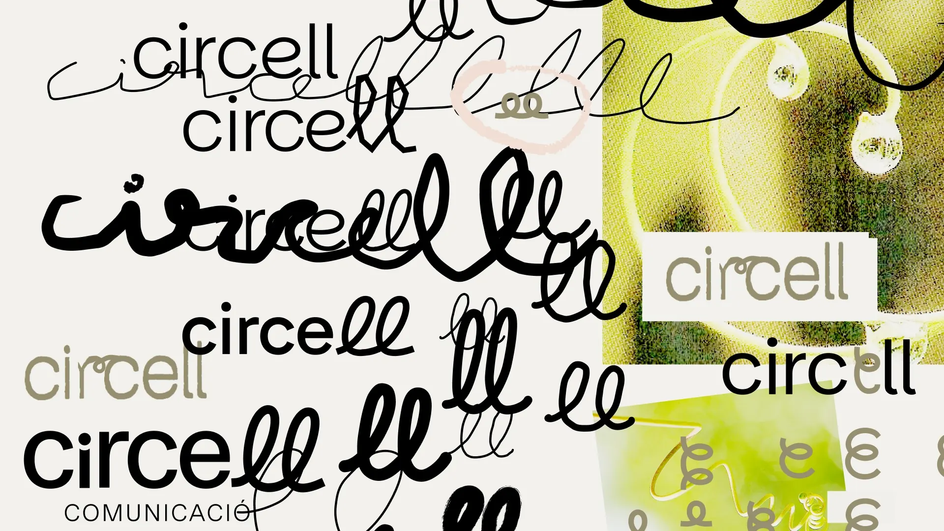
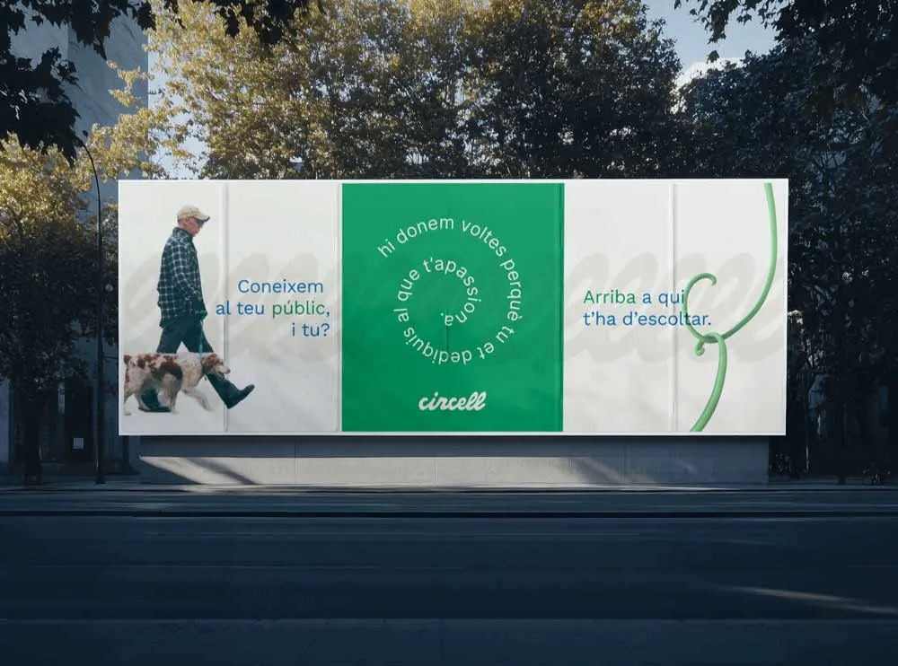
Circell
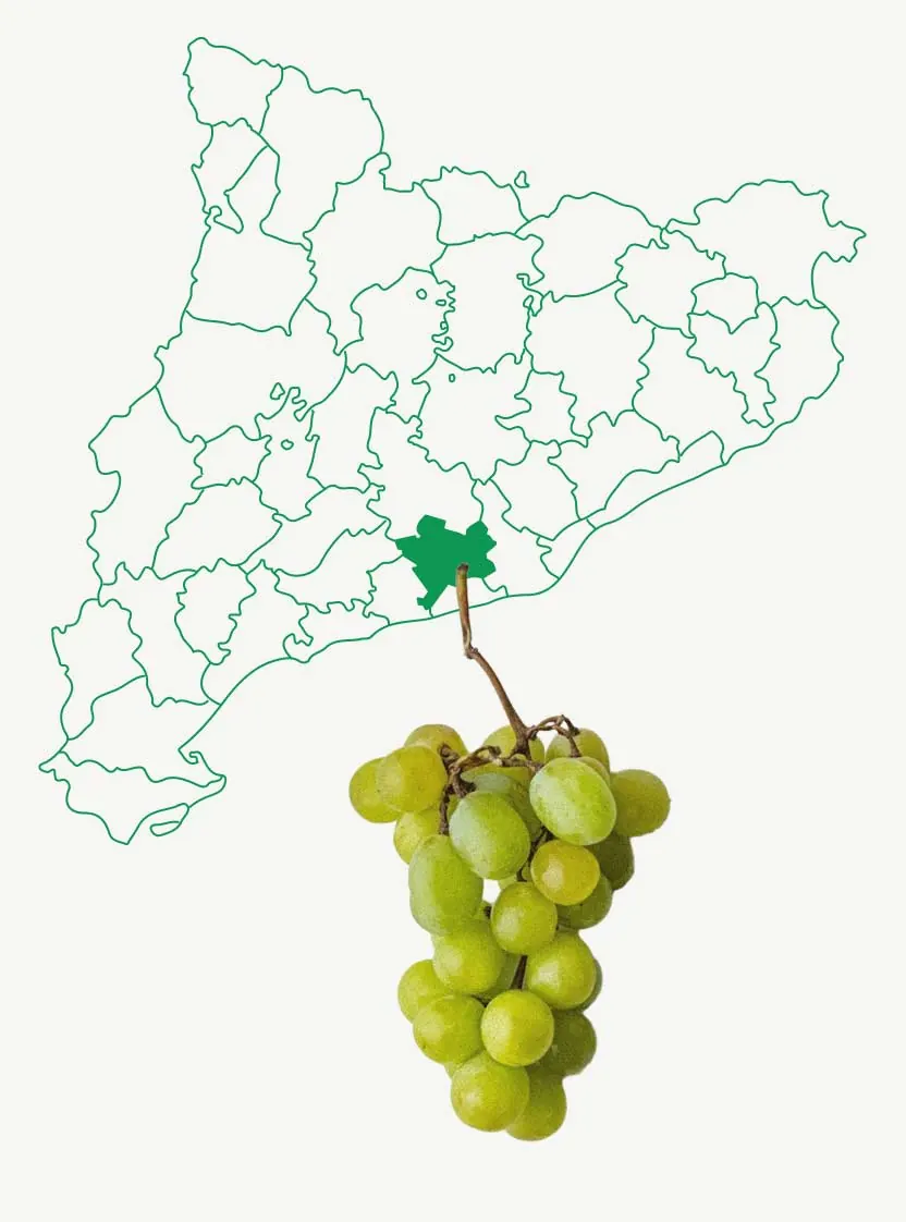
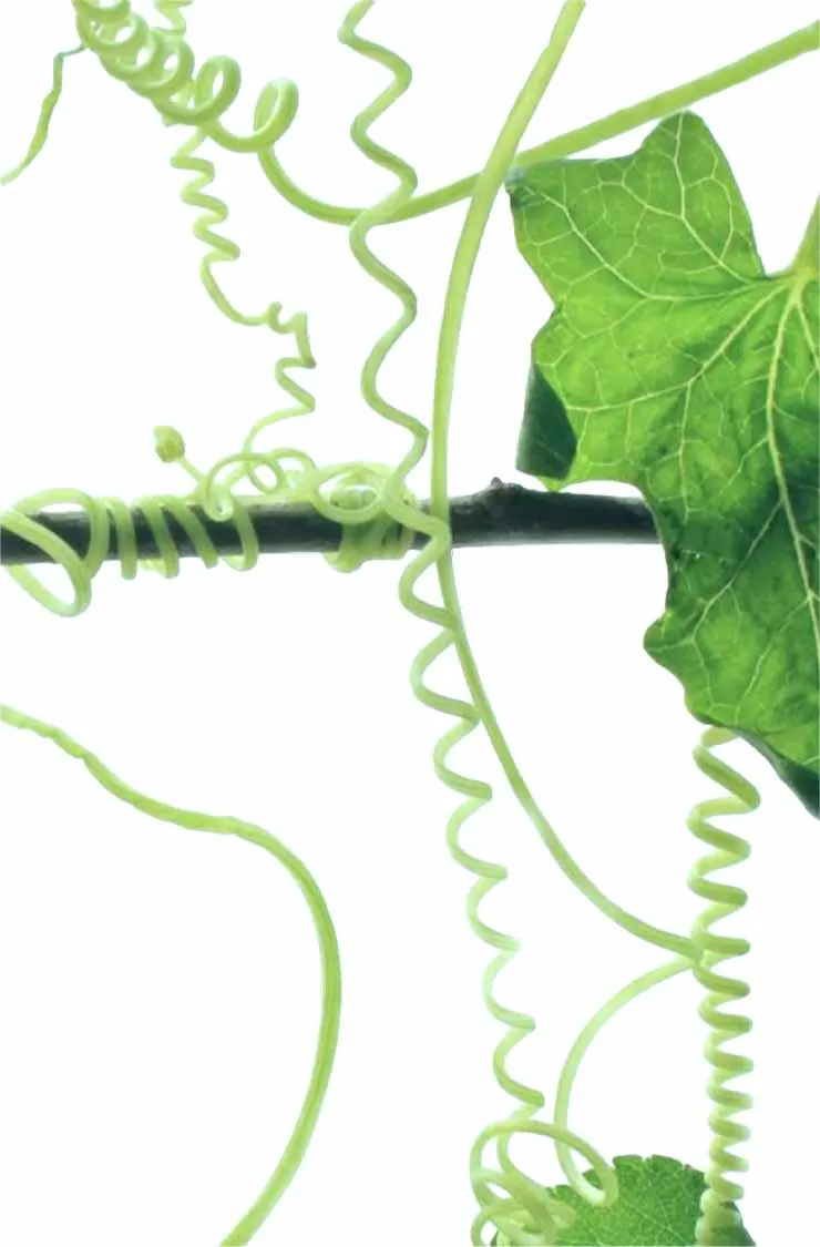
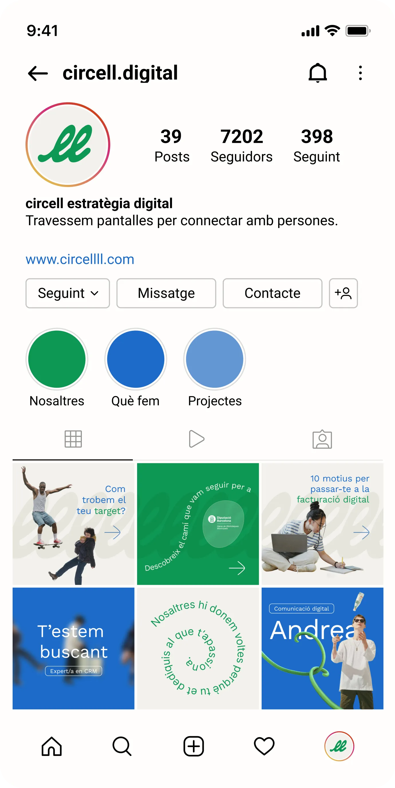
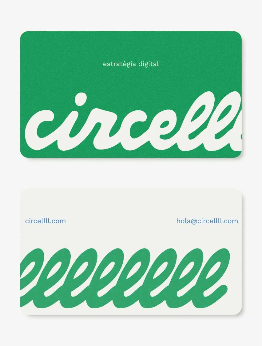
The circell is the part of the vine that guides and supports the plant so it can grow. That is also what Circell wants to be for its audience, a new, small consultancy seeking to put down roots in its territory, Alt Penedès. In this project I was tasked with finding a name that would set apart the founders' human, approachable way of working from their competitors, and with creating graphic communication in line with that, putting people at the centre.
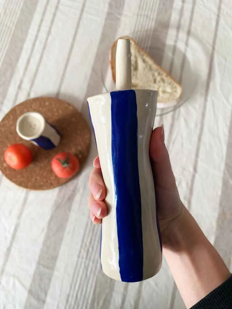
Puny
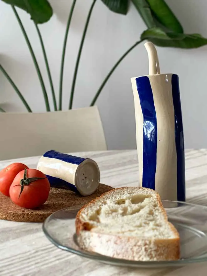
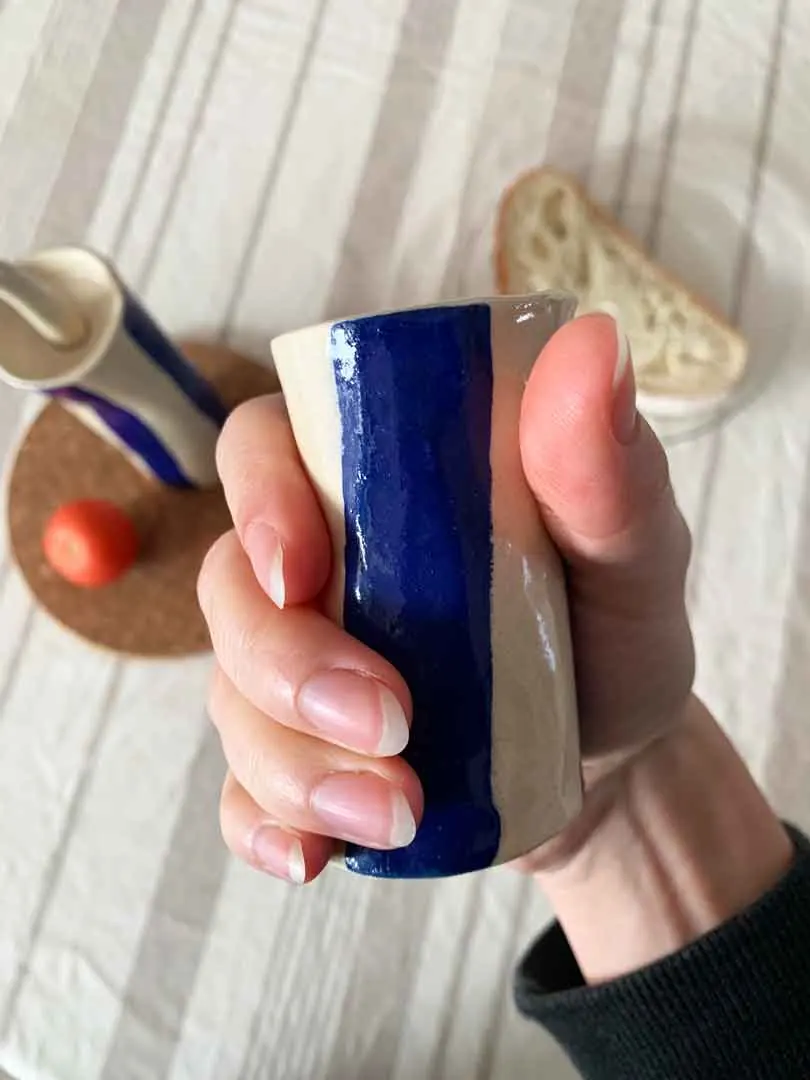
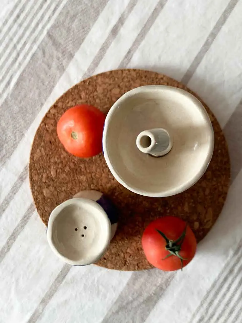
The fist grasps, squeezes, releases. The shapes of these two pieces fit the hand, they are born from that contact; the fist gave them their form, held them. The piece draws its character from the memory of the hand as a primary tool in producing goods such as oil and salt.
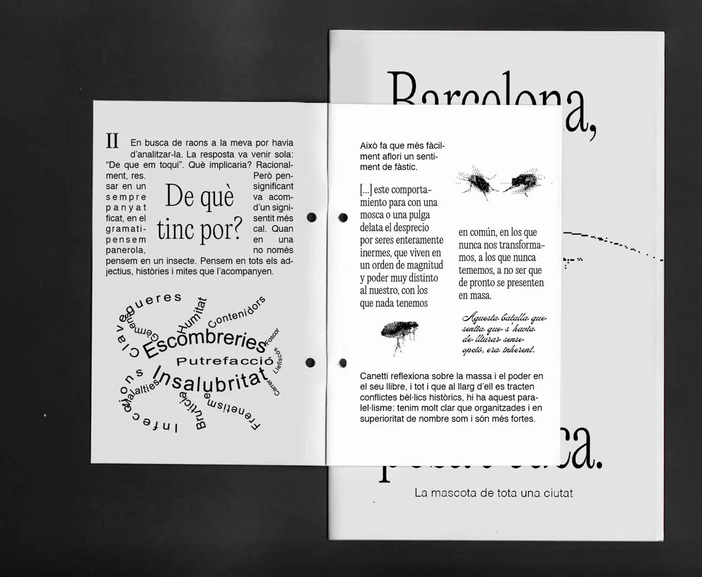
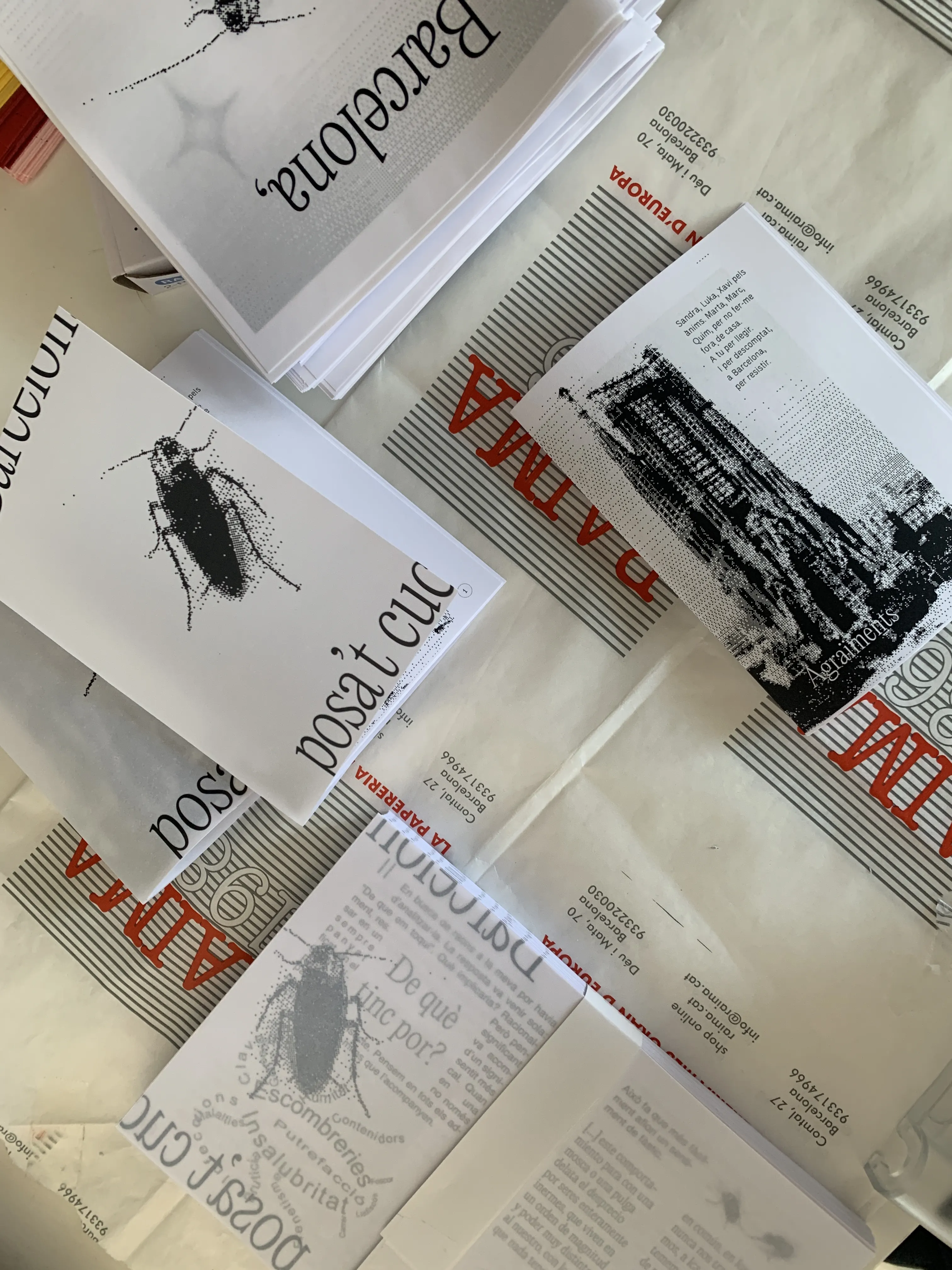
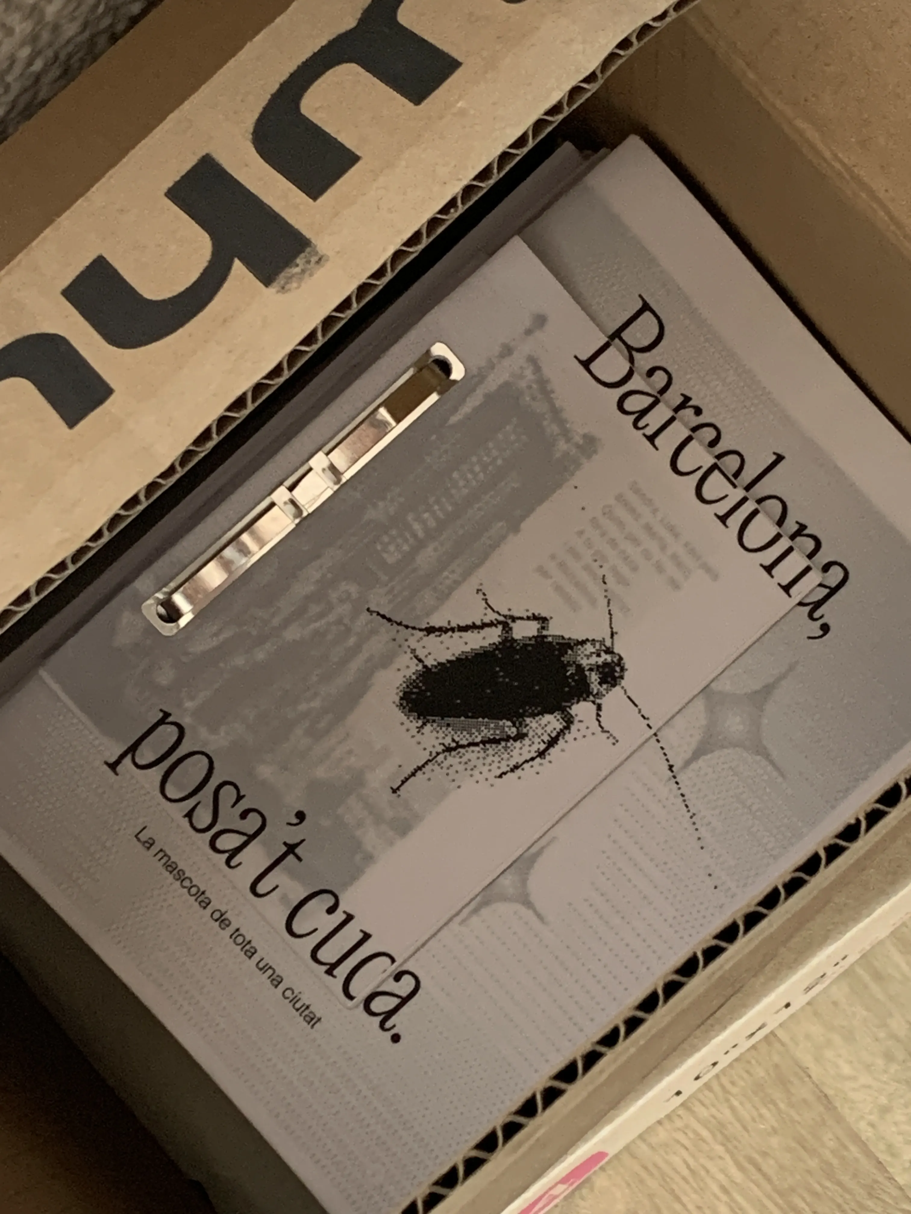
Barcelona, posa't cuca
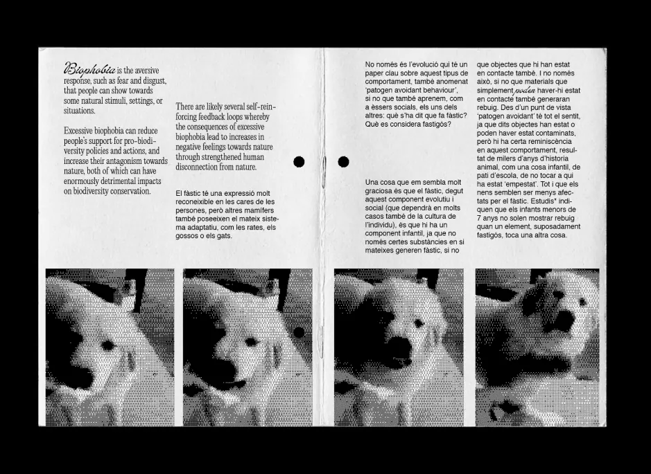
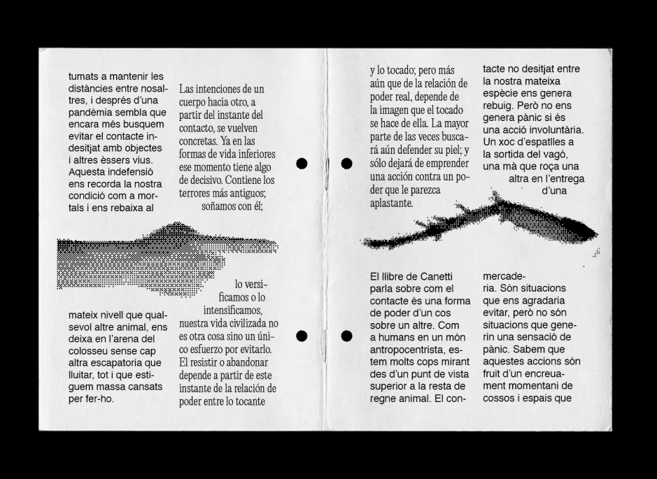
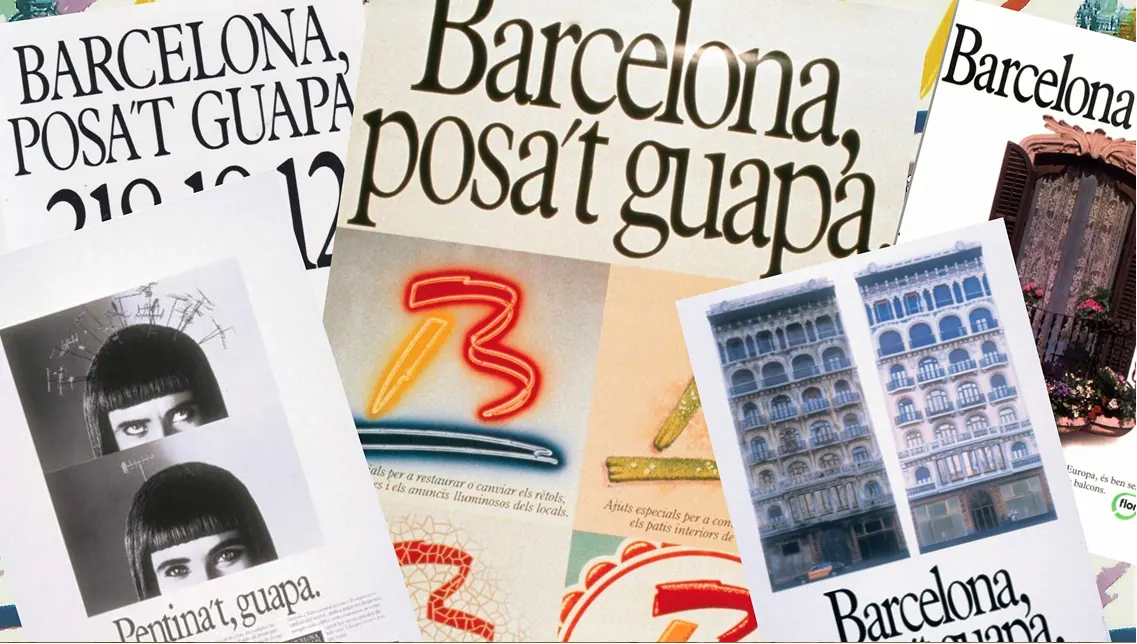
"Barcelona, make yourself pretty" was the slogan of a city council project before the 1992 Olympics, to clean up the face of a city that would be the centre of the world for a season. Despite every effort, Barcelona resists, and one of its most intersectional axes is cockroaches. In this zine I explore fear, disgust, and the resulting biophobia.
The project keeps growing and branching out; I'm now trying to spread a site to log cockroach sightings: Cukilog

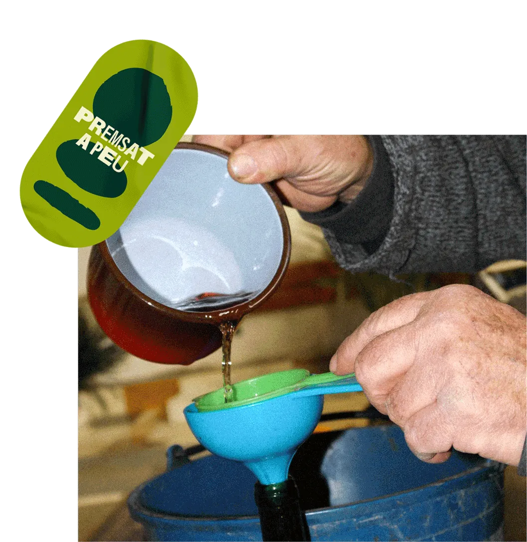
Vi de pagès
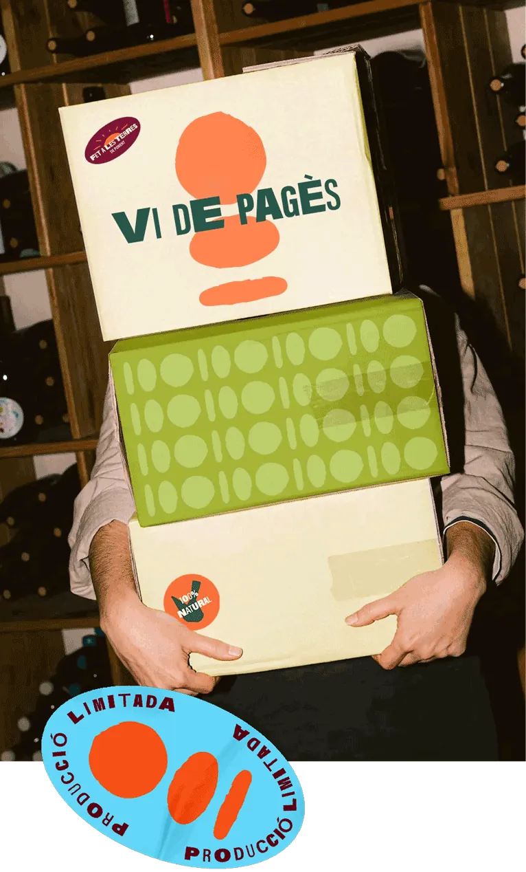
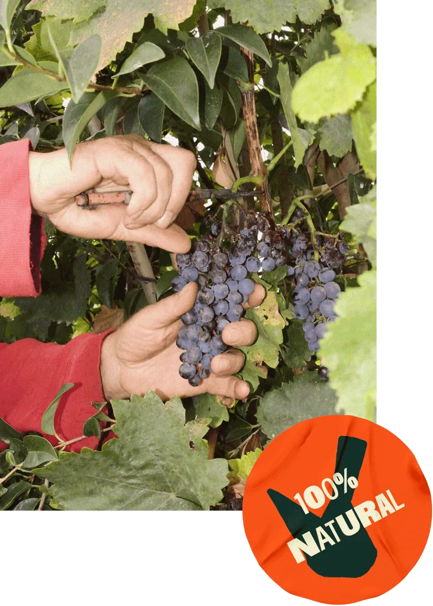
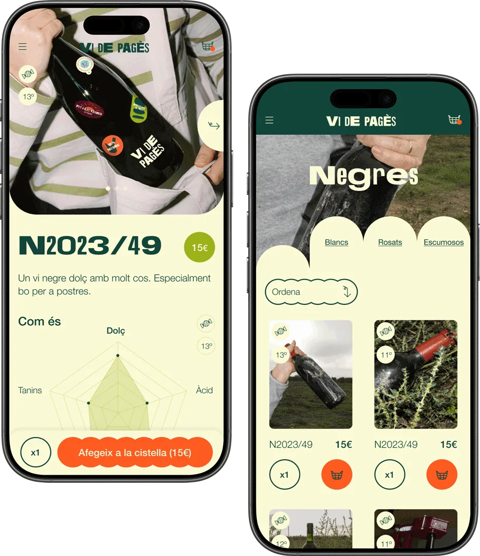
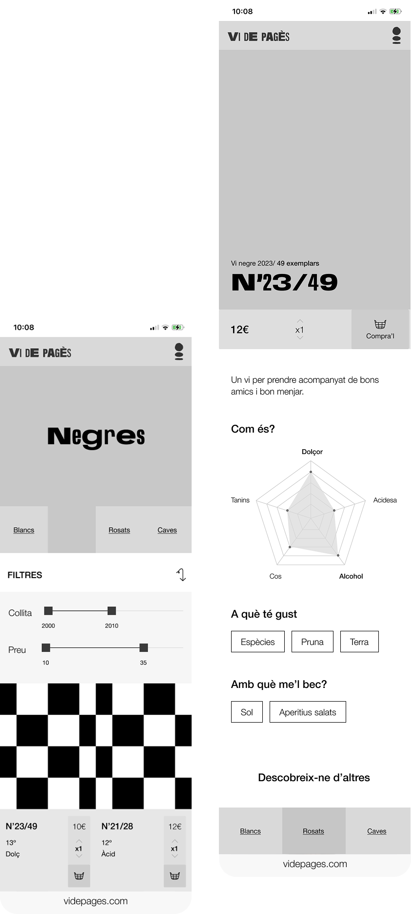
I started documenting how my father makes homemade wine. He tends the vines, not many, presses the wine with his feet, lets it mature, and bottles it. The idea of creating a brand that captured the natural, unpolished essence of this process intrigued me until I carried it through.
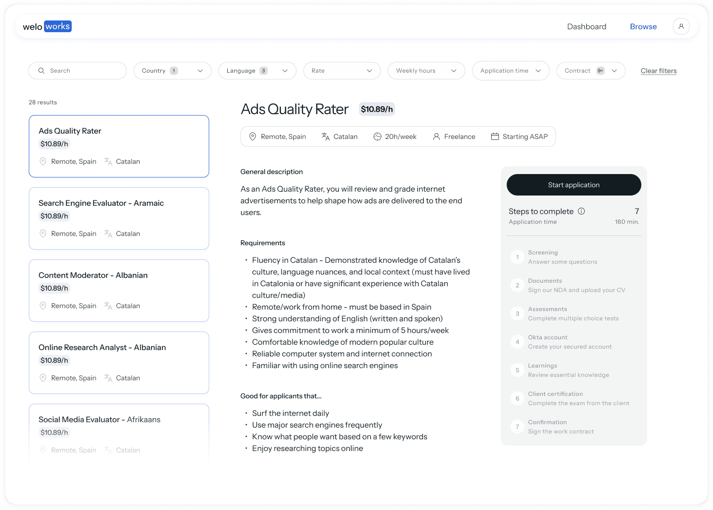
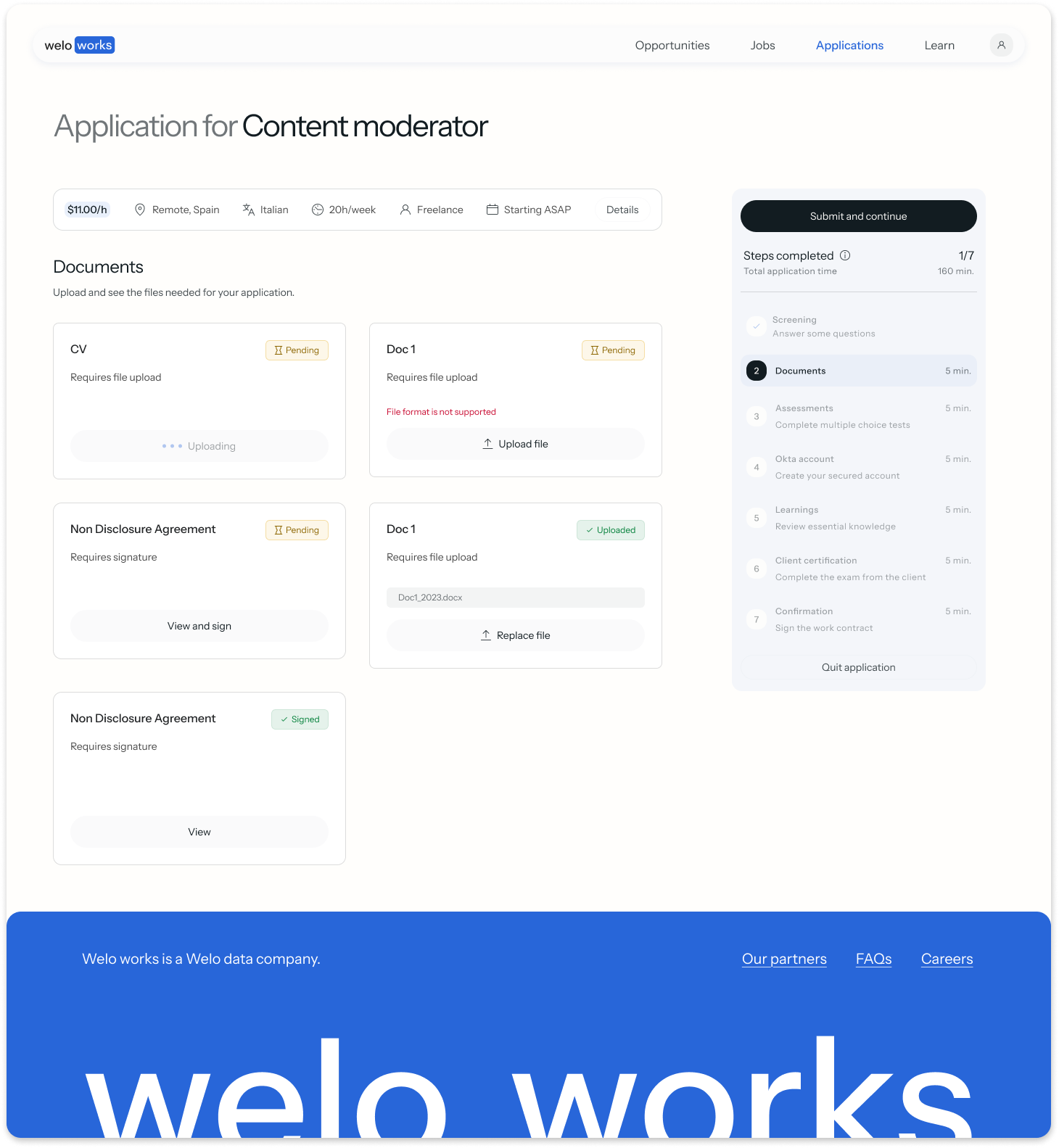
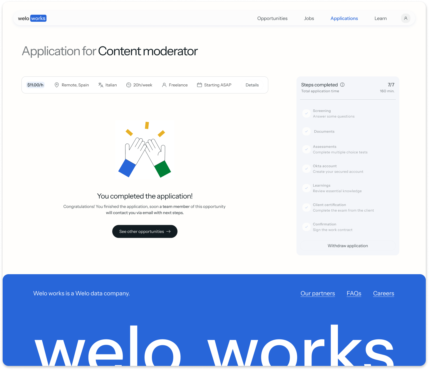
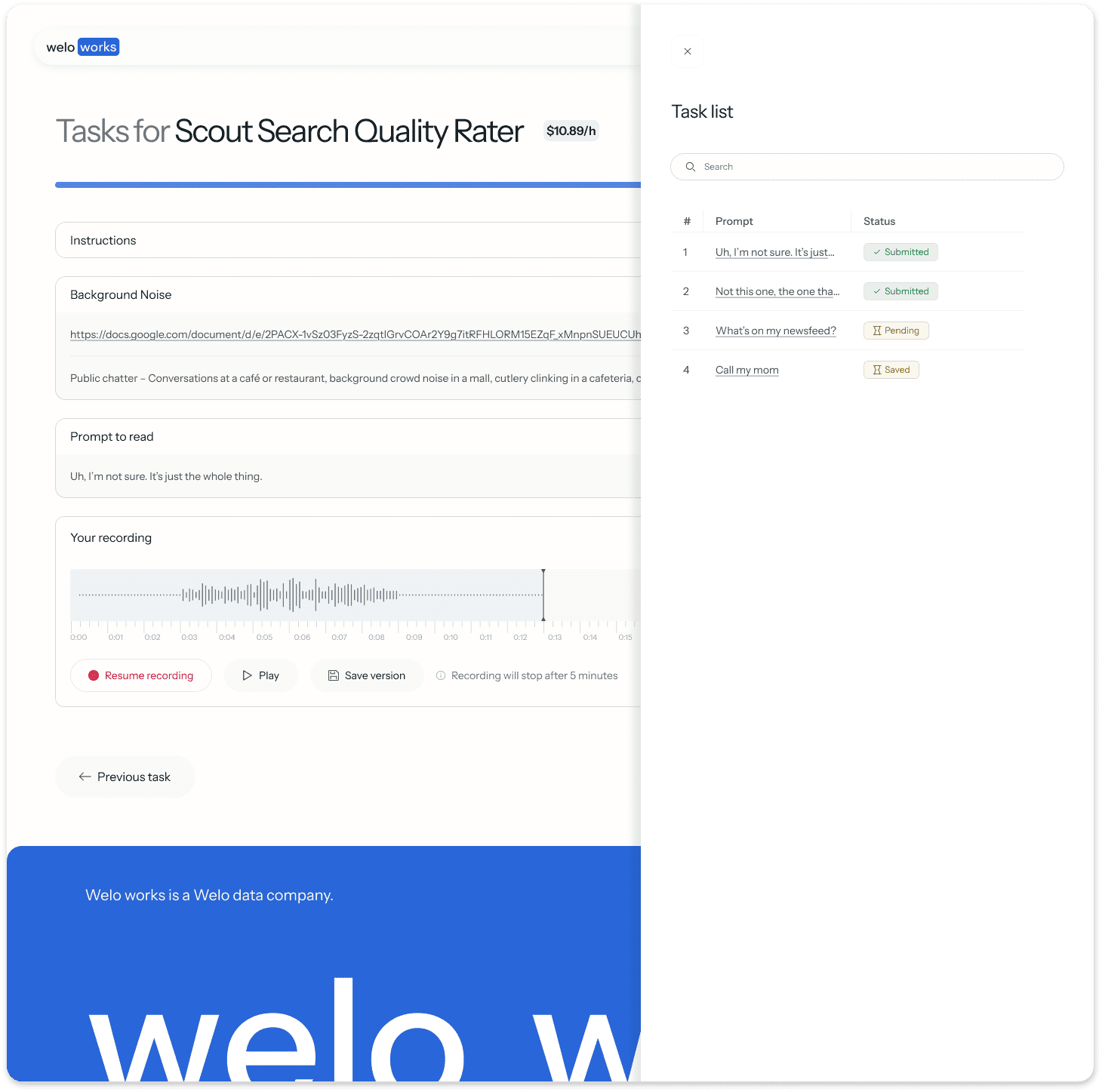
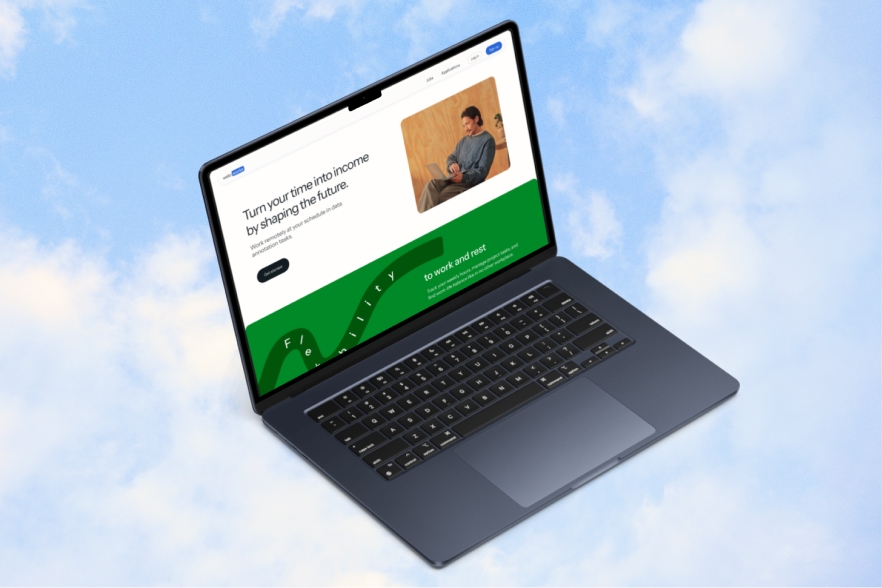
Weloworks
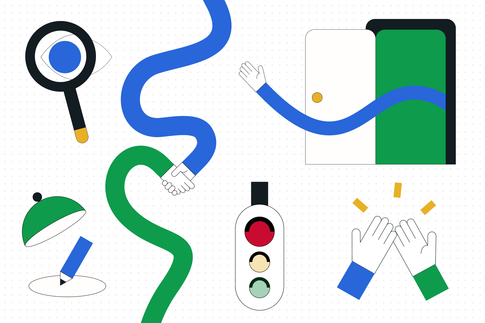
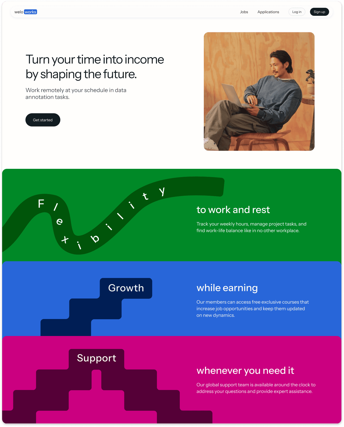
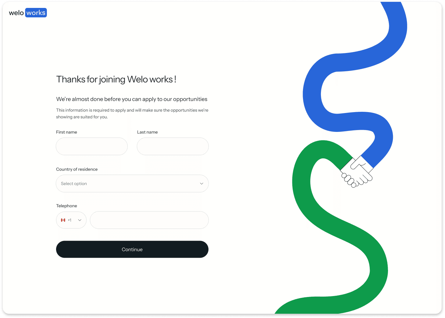
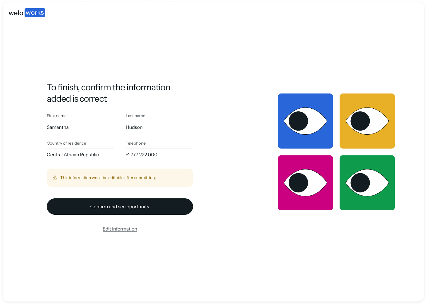
Welo Works is a branch company that recruits people for AI training tasks for large corporations. They needed a revamp of their existing brand, colours, graphic assets, and illustrations with a more tech-focused feel, without losing the human side, since users work inside the site and need to feel at home there. Beyond the redesign, I analysed the previous site, applied improvements, and redesigned user flows. Competitor benchmarking and interviews with current Welo Works users were also key to improving their experience. The reception was positive, positive enough that they started a Reddit thread, lol.